Tuesday, 6 December 2011

5 Tips To Make Your Guitar Mixes Rock!

Now I know there are thousands of variables involved as well as opinionated ways of doing this, that's why I'm going to tell you 5 tips I use to make my guitars stand out to help make my mixes sound huge!

1. Double Track Your Rhythm Guitars:

You can easily thicken up the sound of your mixes by doubling your guitar tracks. Yes I know this is not really a 'mixing' tip but when you use both guitars in the mix it can beef up your guitar tracks. PRO TIP: You can even play around with changing the tone slightly on the second track to add even more emphases on certain characteristics of the playing. Say you want one to be more beefy and use another for note clarity. Just one of many ways you can use that to your benefit.

2. Pan Those Tracks:

The next step is to pan those rhythm guitars you tracked. I like to start at hard panning them both, one left one right. If they are sounding too separate bring them more to the middle, 70-80 is a good area where I like to put my guitars, especially for the slower parts. Faster more intricate playing can benefit from going all the way left or right. Panning these guitars helps separate the sound and clear up the middle for other instruments (i.e. kick drum, bass guitar) that need to be there. Turn that pan knob and immediately hear the results.

3. High Pass Filter Your Guitars:

OK yes, I know this is situational depending on the tone/style of guitar you are tracking. But in most times I mix I like to roll off some of those lows to clear up the bottom section and help your guitars not 'fight' so much with the bass and kick drum. I like to start in the 100,200k area and roll it off accordingly to the mix. Let your ears do the work, roll it off as you listen to a section and when you hear the guitars start to'thin out' back off a hair and Voila! You now have cutting clear guitar.

4. Did Someone say Plug-ins?

Yes you read that correctly. But dude, I thought you are always preaching 'crap in crap out, get it right from the source and you wont have to fix anything come mix time??!' Yes you are correct. I do live by that, but remember music and mixing is an art form. There are rules, but there are not. Weird right? I like to look at using plug-in's like using salt when cooking. You don't want to add too much because it will taste bad, but using just enough will make whatever your eating taste much better! Don't be afraid to add a little compression, or tube saturation/distortion to give your tracks get a little more omph! Experiment, you might find something you really like!

5. EQ Subtraction

The last tip here is my all time favorite, and yes it does play off of tip number 3. Subtracting EQ in certain bands is an ideal way to let other instruments in your mix cut through in return making everything (including your guitar tracks) sound bigger, cleaner and overall better. Especially with high gain guitar tracks cutting some of the lower (or) higher mids out is a good way to tone it down and get your guitars working in cohesion with other primary instruments. Don't be afraid to get the scalpel out and start cutting EQ like your a mad surgeon. Just remember to do it while you are listening to your mix, never solo your guitars and start cutting that would not be pretty.

Monday, 5 December 2011

The Oath of the Horatii

The Oath of the Horatii by Jacques-Louis David is both an excellent example of French Neoclassical painting (click to read more on Neoclassicism from the Met) and of a very strong composition within a painting.  David chose this subject for his first royal commission.  Neoclassical themes had been popular since the Renaissance and in the mid-18th century
Neoclassical art is defined as a style that was strongly influenced by the art and history of ancient Greece and Rome.  While at the French Academy David won the Prix-de-Rome and spent several years in the city during which time he was strongly influenced by Ancient Roman art and architecture.


The Oath of the Horatii is an interesting story, the battle between the Roman Horatii family and the Curiatii family from a neighboring city was told by the Ancient Roman author known as Livy.  The Horatii brothers are swearing allegiance to Rome on the swords that their father is holding up.  All are ready to die to defend their country.
The Oath of the Horatii, Jacques-Louis David, 1784, Louvre, Paris

This is an enormous painting measuring nearly 11 feet high by 14 feet long and the figures were shown as life sized. The focal point for the viewer is the raised hands and swords of the oath, even if the viewer doesn't know the story it can be easily inferred that this is a dramatic event. 

The setting is very sparse and the sparseness works well in framing the events and not detracting from the figures.  To the right we can see the women of the story, their mother and sisters, who are obviously in despair.  This foreshadows the events to come and serves as an interesting counter balance to the strength of the brothers.  One of the sisters was engaged to a man from the rival family and she knows that someone she cares about will most certainly die in the battle.

Why would such an ancient story, one that wasn't a frequent theme be painted in late 18th century France? 

There were several reasons that Neoclassicism became popular at this time.  Visually it was quite a contrast with the frivolous Rococo style that had currently been in fashion.  It was favored by royalty as Neoclassical work reflected the power of the Roman Empire.  It was equally favored by both the American and French Revolutionaries as it tied into themes of self sacrifice and the Roman Republican period.

The ruins of Pompeii were rediscovered in the mid 1700's and in the following years the site was excavated; this led to a new understanding of and enthusiasm for Roman culture.  The 18th century is commonly referred to as "The Age of Enlightenment" and many of the great intellectuals and philosophers were influenced by the rational philosophies of their Classical counterparts.


The Tennis Court Oath, Jacques-Louis David, c-1791, Louvre, Paris
pen drawing with sepia ink wash

While The Oath of the Horatii was commissioned by the French King, David was actually very much on the side of the revolutionaries in the 18th century.  He created the above drawing of the Tennis Court Oath, where nearly 600 members of society gathered less than a month prior to the storming of the Bastille and vowed to remain together until a French Constitution was written.

David was clearly influenced by his earlier composition for this sketch, which he later turned into a painting.  The raised arms created another strong central focal point for the viewer.  Even without knowing the history behind the work the viewer can discern that an emotionally charges and dramatic event is unfolding.  Just as in the other work a symmetrical architectural background frames the scene.

The Oath of the Horatii, Armand-Charles Caraffe, 1791
Pushkin Museum, Moscow


 Armand-Charles Caraffe was a student of David's and he also painted a version of this theme.
Compare the two paintings, by looking at the two very different ways that the artists chose to arrange the figures we can see that the David painting is much more dynamic.  The theme of the Oath that the Horatii family took wasn't a common one and Caraffe would certainly have been influenced by David.  However by reversing the direction of the brother's hands the composition doesn't have as strong of a focal point.  Dramatic tension was also created in the earlier version by the use of chiaroscuro (modeling form with strong darks and lights).


Caraffe does a good job of depicting this and created an interesting work, but Jacques-Louis David's version has remained one of the most iconic images of Neoclassical French painting.

Wednesday, 16 November 2011

Trompe-l’oeil in art

In January of 2010 I saw a really interesting exhibit at the Palazzo Strozzi in Florence: Art & Illusions: Masterpieces of Trompe-l'œil from Antiquity to the Present.  That exhibit got me to start thinking of the role of  trompe-l’oeil in art.  “Trompe-l’oeil” is French for to trick the eye, it is more than just a realistic work of art but it is something created to fool the viewer or at least make the viewer question what they are seeing.  It is a work which creates an optical illusion, however the term “Trompe-l’oeil” is used to describe a variety of illusions in art.  Some are entertaining and some create quite sophisticated illusions.

There have been many examples throughout time: Ancient Roman, Medieval, Renaissance and Baroque as well as modern and contemporary examples.  Let's look at a few of them to compare.
Still life with glass bowl of fruit and vase, wall painting, Pompeian painter c- 70 AD,
The National Archaeological Museum of Naples, Italy

In the wall paintings uncovered at Pompeii and Herculaneum there are many examples of trompe-l’oeil.  The most typical were similar to the example above showing still-life objects sitting on a "shelf" they were created to show off the skill of the artist and to amuse the viewer.  There were also several mosaic floors created as a trompe-l’oeil showing discarded fish bones.  This skillful works also alluded to the wealth of the owner of the home.

It was said in Ancient Greece that there was a contest between two painters, Zeuxis and Parrhasius.  Zeuxis painted grapes that were so realistic they fooled birds into trying to eat them.  However Parrhasius won the contest as he even fooled the other artist; he had painted a pair of curtains and Zeuxis thought that his painting lay behind the curtains.

I don't know if the story is real, but regardless it demonstrates that trompe-l’oeil has been a part of art for centuries.

Painting of a false dome, Andrea Pozzo, 1685, Chiesa di Sant'Ignazio, Rome, Italy
photo- © Jean-Christophe BENOIST/ public domain, via Wikimedia Commons  

Painter Andrea Pozzo cleverly created a false dome within the church of Sant'Ignazio in Rome.  The illusion works perfectly if the viewer is standing in a certain area, they would look up and see a "dome" which is in fact a flat surface with a fake dome painted in.  It is clever as no one would be expecting this type of trompe-l’oeil in a church.  However if the viewer is standing in another area the trick doesn't work.
Architectural trompe-l'oeil gallery, Francesco Borromini, Palazzo Spada, Rome, 1638 
Trompe-l’oeil in art can also be found in sculpture and architecture such as this example by Borromini done earlier in the century. This gallery is a tour de force of trompe-l’oeil in which shrinking rows of columns and a rising floor create the illusion that the gallery is four times longer than it is.  The illusion is made through the use of light, spacing of the columns and the fact that the two archways are vastly different heights.

At first glance Borromini’s gallery is quite long, leading to a statue at the end.  The statue is about three-quarters the height of the distant doorway.  However when I visited a guide walked from one end to the next to show our group of students the illusion; at the far end she was the same height as the statue, but as she walked along the path we saw she was only about a quarter of the height of the first archway.

This can be explained when you realize that the two doorways are of different heights.  However since Borromini constructed this with seemingly perfect perspective, the false perspective tricks you into believing that both doorways are of the same height if you walked from one to the other.

The Staircase Group (Portrait of Raphaelle Peale and Titian Ramsay Peale), Charles Willson Peale, 1795,
oil on canvas, Philadelphia Museum of Art; The George W. Elkins Collection

 In this work early American painter Charles Willson Peale creates a trompe-l’oeil by painting life size portraits.
“To enhance the illusion, he installed the painting within a doorframe in his studio, with a real step in front. Rembrandt Peale, another son, recalled that his father's friend George Washington, misled by Peale's artifice, tipped his hat and greeted the two young men as he walked by.”*
*Darrel Sewell, from Philadelphia Museum of Art: Handbook of the Collections (1995), p. 267.

Again the Art & Illusions: Masterpieces of Trompe-l'œil exhibit was one of the most interesting art exhibits I have seen: 150 objects related to illusion. Examples really did “trick the eye” into thinking surfaces weren’t flat, objects were coming off the canvas, the canvas was  a piece of wood, or a cabinet with open doors, or something was sculpted rather than painted.  Some  were truly remarkable and I wanted to reach out and touch them as the illusion was so convincing.  

I actually did get tricked with a Duane Hanson sculpture. Hanson was a late 20th century American “hyper-realist” who sculpted people and used real objects in his sculptures, in that exhibit it was a mom pushing a stroller. I didn’t really look at “her” I thought it was a mom pushing a stroller until the person next to me got so close they set off an alarm and then everyone turned to stare and I was truly startled that they weren’t real.  They had her set up as if she was a spectator looking at a painting, which added to the illusion.

That is probably why trompe-l’oeil has worked well and has endured to the present day, because so many examples really do fool the viewer.

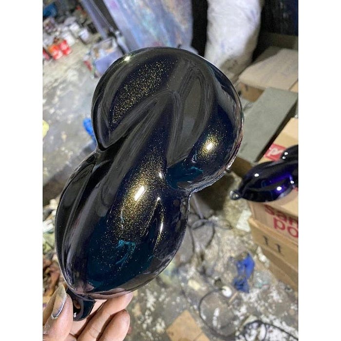
Cat Moonblack gold PU

  Cat Moonblack gold PU  adalah salah satu series yang mengandung partikel kecil seperti crystal yang dan memiliki effect lebih gelap sehing...